How to Read macd indicator: Quick Guide for Traders To really get a feel for the MACD indicator, you have to look at how its three main parts work together: the MACD line, the signal line, and the histogram. At its core, when the faster MACD line pushes up and crosses above the slower signal line, it’s often a bullish signal—a hint that momentum is building to the upside. If it crosses below, you're looking at potentially bearish momentum. The histogram is your visual confirmation, showing you just how strong those moves really are.
Decoding the MACD: What Every Trader Sees Before you can start spotting solid trades, you need to understand the DNA of the MACD indicator. It's not just a bunch of squiggly lines on a chart; it’s a direct look into a market's momentum. Gerald Appel cooked this up back in the late 1970s, and the MACD (Moving Average Convergence Divergence) has been a go-to for traders ever since. If you're new to this, getting a handle on the basics of technical analysis for beginners will give you a great foundation. At its heart, the indicator takes two Exponential Moving Averages (EMAs)—typically the 12-period and 26-period EMAs—and subtracts the longer one from the shorter one. The result is the main MACD line. Then, a 9-period EMA of that MACD line is plotted right on top of it. We call that the Signal Line, and it’s what gives us our trigger for potential trades.
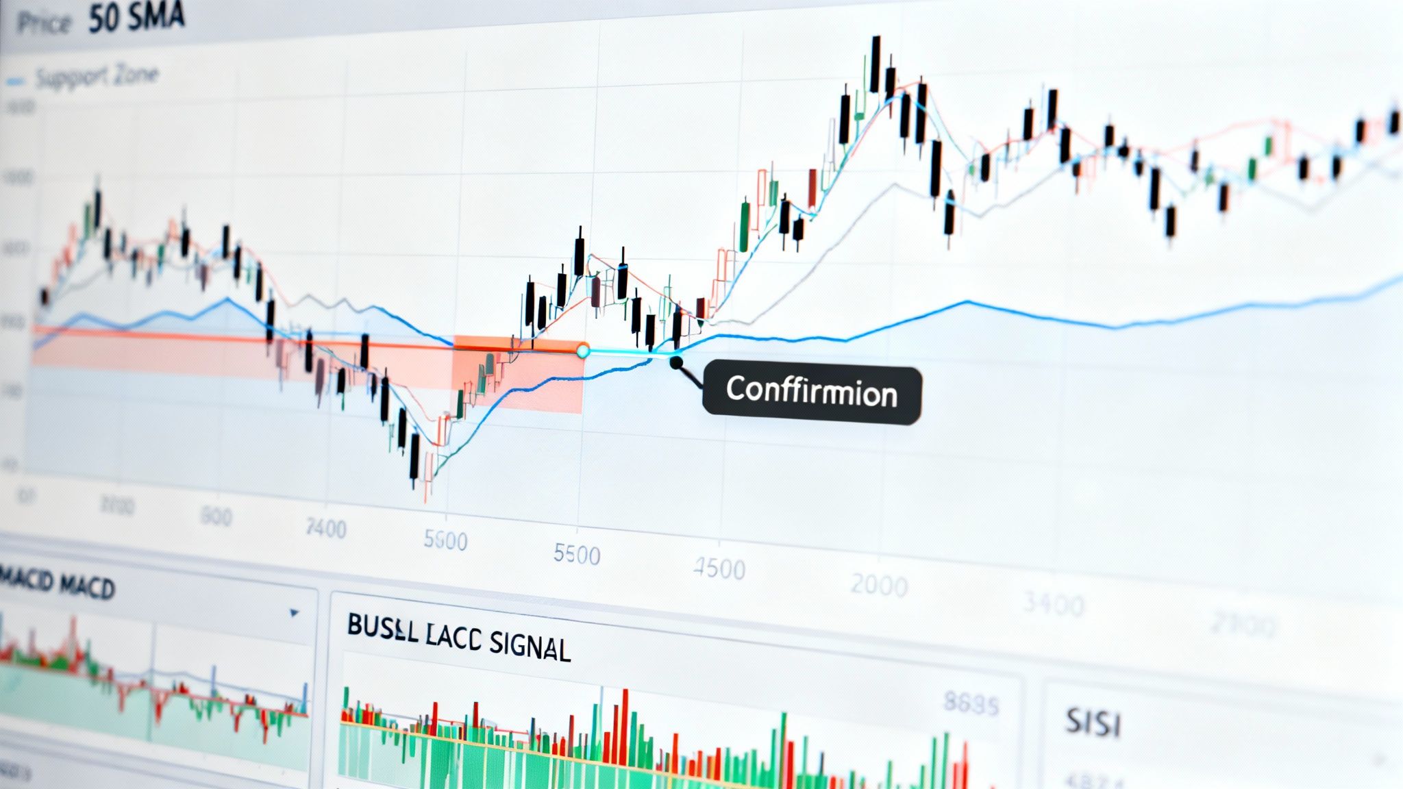
The Three Core Components Think of the MACD as a small dashboard with three gauges all feeding you information about the market's engine. Get to know them, and you'll know what to look for. - The MACD Line (The "Fast" Line): This is your main momentum line, calculated by subtracting the 26-period EMA from the 12-period EMA. Its movement gives you a read on the direction and strength of the short-term trend. It's the engine's RPMs. - The Signal Line (The "Slow" Line): This is simply a 9-period EMA of the MACD Line itself. Because it's an average of the MACD line, it moves a bit slower and smooths things out, acting as a baseline. When the fast line crosses it, it signals a potential shift in momentum. - The Histogram: This isn't just for decoration. The histogram is a simple bar chart that shows you the distance between the MACD line and the Signal line. When the MACD line is above the signal line, the bars are positive (above zero). When it's below, they're negative. Taller bars mean momentum is picking up speed; shrinking bars mean it's running out of gas. These elements aren't just for stocks. They’re absolutely crucial for navigating volatile markets, making them a key part of learning how to read crypto charts effectively.>Pro Tip: The histogram often tips you off before anything else. When you see those bars start getting shorter and pulling back toward the zero line, it’s a heads-up that the current trend is weakening—often before the MACD and signal lines actually cross. The chart below shows all three parts in action, illustrating how they dance together to signal changes in market momentum. You can see it right there—the points where the blue MACD line crosses over or under the orange Signal line are your classic entry or exit signals, with the histogram's behavior backing up the story. To make things even clearer, here's a quick cheat sheet for interpreting the most basic MACD signals.
Quick Guide to Basic MACD Signals
| Signal Event | What It Looks Like | Potential Meaning | |:--- |:--- |:--- | | Bullish Crossover | The MACD Line crosses above the Signal Line.
| Upward momentum is increasing; a potential buy signal.
| | Bearish Crossover | The MACD Line crosses below the Signal Line.
| Downward momentum is increasing; a potential sell signal.
| | Histogram Grows | Bars on the histogram get taller (away from zero).
| The current trend (bullish or bearish) is strengthening.
| | Histogram Shrinks | Bars on the histogram get shorter (toward zero).
| The current trend is losing momentum; a potential reversal is near.
| This table covers the fundamentals. Keep these simple rules in mind as you start watching the MACD, and you'll quickly build an intuitive feel for what the market is trying to tell you.
Interpreting Signal Line Crossovers The most common signal you'll see is the Signal Line Crossover. For many traders, this is the bread-and-butter buy or sell trigger. It's straightforward and gives you a clear heads-up about a potential shift in short-term momentum. * A bullish crossover happens when the fast-moving MACD line climbs above the slower Signal line. Think of it as the market’s engine revving up. Short-term momentum is starting to pull ahead, suggesting buyers are taking the wheel. Many traders see this as their cue to start looking for a long entry. * A bearish crossover is the opposite: the MACD line dips below the Signal line. This is a warning that downside momentum is picking up. Sellers might be stepping in, which could be a signal to open a short position or cash out of a long one.>Pro Tip: A bullish crossover that happens below the zero line (in bearish territory) is often a much stronger sign that a bottom might be forming. Likewise, a bearish crossover way up in bullish territory can be a powerful warning that a top is getting close.
Watching for Centerline Crossovers Signal Line Crossovers are great for short-term moves, but Centerline Crossovers signal a much bigger shift in the market's overall trend. This is when the MACD line itself crosses the zero line, moving from negative to positive or vice versa. When the MACD line pushes up from negative territory into positive, it’s telling you that the 12-period EMA has officially overtaken the 26-period EMA. This isn’t just noise; it’s a meaningful sign that bullish momentum is now the dominant force. A lot of trend-followers wait for this confirmation before fully committing to a long-term bullish outlook. If the line drops from positive to negative, the tide is turning bearish. The prevailing uptrend might be over, giving a much stronger case for a long-term short position. These centerline moves help you tune out the minor whipsaws and focus on the bigger picture. Understanding these events is a core part of knowing what buy, sell, and hold signals mean in the grand scheme of things.
The Power of MACD Divergence This is where the MACD really shines. Divergence is arguably the most powerful—and predictive—signal the indicator offers. It happens when the asset's price is heading in one direction, but the MACD is quietly moving in the opposite direction. That disagreement between price and momentum is often a heads-up that a major trend reversal is brewing. You’ll want to keep an eye out for two types of divergence: * Bearish Divergence: The price hits a new higher high, but the MACD can't keep up and instead forms a lower high. This is a huge red flag. It’s saying, "Sure, the price looks good, but the buying power behind it is fading." A reversal to the downside could be right around the corner. * Bullish Divergence: The price drops to a new lower low, but the MACD refuses to follow, carving out a higher low instead. This is a classic sign that sellers are running out of gas. Even as the price falls, the downward momentum is drying up, hinting that a bullish reversal might be setting up. Spotting divergence takes practice because it's more subtle than a simple crossover. But when you find a clear divergence, especially on a higher timeframe, treat it as a serious warning that the current trend is on its last legs.
Building a Real-World MACD Trading Strategy Reading the signals is one thing, but a list of signals isn't a strategy. To actually trade well, you need a concrete plan—clear rules for when you get in and when you get out. This is where we turn MACD theory into a practical framework that has risk management baked in from the start. A solid strategy never hinges on a single signal, like a lone crossover. It demands confirmation. For example, a bullish MACD crossover is interesting. But a bullish crossover that's confirmed by a growing histogram? Now that's a much stronger signal. It tells you that momentum hasn't just shifted, but it's actually picking up steam, giving you a much higher-probability entry.
Defining Your Entry and Exit Rules Let's walk through building a simple, rule-based approach for a long trade. The whole point of having rules like this is to keep you disciplined and stop you from making emotional calls in the heat of the moment. Here’s a solid three-part checklist for a long entry: * The Initial Alert: The MACD line must cross above the Signal line. This is what first gets our attention.- The Confirmation: The histogram needs to be positive (above the zero line), and its bars should be getting taller. This confirms that momentum is building. - The Trend Filter: Ideally, this crossover happens while the price is already above a key moving average, like the 50-period EMA. This helps ensure you’re trading with the broader trend, not against it. You'd only pull the trigger on a long position when all three of those conditions are met. For a short trade, you'd just flip these rules upside down.>A disciplined trader waits for their setup. If only two of your three entry rules are met, you don't have a trade; you have a reason to wait. Patience is what separates consistently profitable traders from the rest. This visual flow chart breaks down the primary signals that form the foundation of any MACD-based strategy.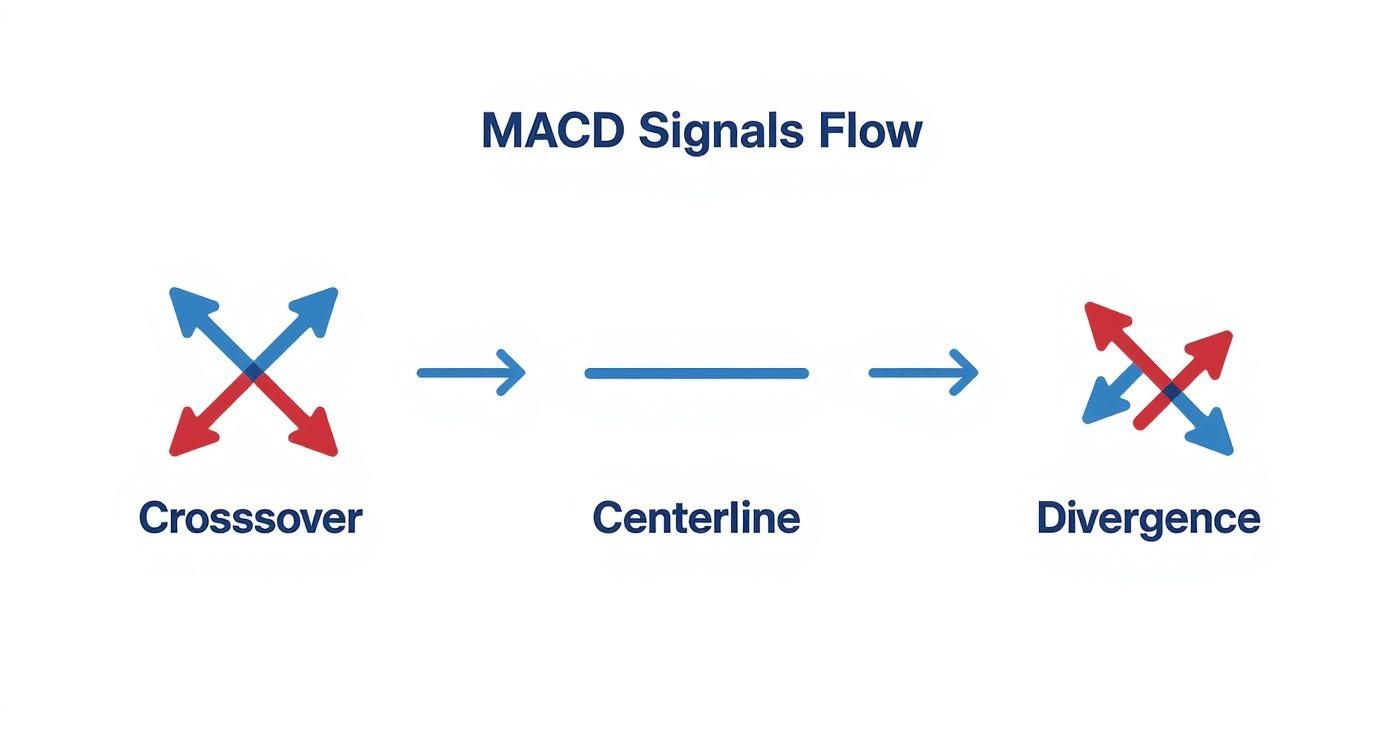 The chart really zeroes in on the core decision points—crossovers, centerline moves, and divergences—that you'll build your trading rules around.
Integrating Crucial Risk Management No strategy is complete without risk management. You have to know where your stop-loss and take-profit levels are before you even think about entering a trade. - Setting a Stop-Loss: For our long trade example, a logical spot for a stop-loss is just below the most recent swing low that formed before the MACD crossover. This gives the trade some room to breathe without exposing you to a massive loss. - Defining a Take-Profit: You could set a take-profit at a known resistance level on the chart. Another popular method is to let the indicator tell you when to get out—you could decide to exit the trade as soon as a bearish MACD crossover occurs, signaling that momentum has turned against you. You can practice spotting these signals and setting your risk levels without putting any real money on the line. Using a tool like a crypto trading signal simulator is a great way to build confidence first.
Adjusting MACD for Different Markets The standard (12, 26, 9) settings aren't a magical, one-size-fits-all solution. This is especially true in the crypto markets, where things move a lot faster. The high volatility often means you need to tweak the parameters to cut down on noise and false signals. For day trading a really volatile coin, some traders tighten things up with faster, more responsive settings like (5, 35, 5). On the flip side, if you're swing trading on a daily chart, you might want to slow it down with settings like (20, 50, 9) to filter out minor moves and focus only on major trend shifts. The key is to experiment and find what actually works for the specific asset and timeframe you're trading. Once you've landed on a MACD strategy with custom settings, the next critical step is to validate it. You can learn how to backtest trading strategies to make sure your approach holds up under real historical market conditions.
Resisting the Urge to Chase Every Signal Another common trap is what I call "signal chasing"—blindly jumping into a trade on every single crossover without any other confirmation. A bullish crossover might look tempting, but if it happens right below a major resistance level or while the overall market volume is drying up, you could be walking straight into a trap.>Key Takeaway: A MACD signal is not a command to trade. Think of it as a piece of evidence. Your job is to gather more evidence from other sources before you pull the trigger. Always look for confirmation. For instance, you could validate a MACD signal by checking for a few other things: - Supporting Price Action: Does the crossover line up with a bounce off a key support level or a breakout from a chart pattern like a triangle? - Volume Confirmation: Is there a spike in trading volume along with the signal? A surge in volume adds serious credibility to a move. - Alignment with the Broader Trend: Is the signal pointing in the same direction as the trend on a higher timeframe? Fighting the primary trend is a low-probability game.
Acknowledging the MACD's Evolving Effectiveness It's also crucial to get that no indicator works perfectly forever. Market dynamics change, and our strategies have to adapt. A backtest looking at MACD signals in the years after 2000 found its win rate had dropped to around 44%, a noticeable slide from how it performed in previous decades. This suggests that as markets evolve, just using the default settings can become less effective. You can see more on this in these insights into the MACD’s historical performance. Ultimately, mastering the MACD isn’t just about knowing what the signals mean. It’s about knowing when not to trust them. By learning to spot choppy market conditions, demanding confirmation, and always keeping an eye on the bigger picture, you can sidestep these common mistakes and use the MACD much more strategically.
Creating a Powerful Indicator Toolkit One of the best partners for the MACD is the Relative Strength Index (RSI). They work beautifully together. While the MACD is all about momentum, the RSI tells you if an asset is getting overbought or oversold. Imagine you spot a bullish MACD crossover. That’s a good start. But if the RSI is also just starting to climb out of oversold territory (below 30), that’s a powerful one-two punch. It’s a strong signal that the bottom might be in and a new upward move is just getting started. Another fantastic tool is simple price action, specifically support and resistance levels. A bullish MACD crossover is interesting, but a bullish crossover that happens right as the price bounces off a major support zone? That’s an A+ setup. The support level acts as a floor, validating the momentum signal from the MACD.>A high-probability trade often happens at a point of confluence—where multiple signals all tell you the same story. When the MACD, RSI, and a key price level all align, it’s time to pay very close attention.
Using Moving Averages as a Trend Filter Perhaps the simplest and most effective addition is a long-term Simple Moving Average (SMA), like the 50-period or 200-period. Think of this as your ultimate trend filter. A dead-simple rule of thumb is to only take buy signals from the MACD (like a bullish crossover) when the price is trading above the 200 SMA. Conversely, you’d only entertain short signals when the price is trading below it. This single discipline keeps you on the right side of the dominant market trend. It stops you from getting chewed up trying to fight a powerful current and will save you from countless unnecessary losses. Researchers are always looking for an edge. A 2018 study developed an enhanced version called the MACD-HVIX, which incorporates a volatility index to refine its signals. The results? This optimized version showed a predictive accuracy that was 33.33% higher for a 5-day outlook compared to the classic MACD. You can read more about these innovative MACD enhancements and see how the pros are pushing the boundaries.
Got Questions About the MACD? We've Got Answers Once you get the hang of the MACD, a few common questions always seem to pop up. Nailing down these details is what separates consistently profitable traders from the ones who get chopped up by false signals. Let's tackle the questions I hear most often.
What Are the Best Settings for the MACD Indicator? This is the big one. While 12, 26, and 9 is the classic setup you'll see everywhere, there's really no "best" setting that's a magic bullet for every market or timeframe. The right parameters depend completely on how you trade and how volatile your chosen asset is. For example, a day trader trying to scalp quick moves on a 5-minute chart might tighten the settings to something like (5, 35, 5). This makes the indicator far more sensitive to immediate price action. On the flip side, a long-term investor looking at weekly charts might slow it down to filter out the daily noise and focus only on major, durable trends. The only way to know for sure is to get your hands dirty. Go backtest different combinations on the charts you trade and see what has actually worked in the past.
Can I Use the MACD for Cryptocurrency Trading? Absolutely. The MACD is a go-to tool for thousands of crypto traders. But here's the catch: crypto's insane volatility can make the standard settings spit out a ton of fakeouts and whipsaws, which is incredibly frustrating. To deal with this, many seasoned crypto traders will "de-tune" the indicator by using slower settings, like (20, 50, 9). This helps smooth out the noise and focuses the signals on more significant moves. Another pro tip is to jump up to a higher timeframe. Instead of getting bogged down in the 15-minute chart chaos, try applying the MACD to the 4-hour or daily chart. The signals you get will be fewer, but they'll often be far more reliable. And never use it in a vacuum—always confirm signals with other tools, especially volume.
What Is the Biggest Difference Between the MACD Histogram and the Lines? This is a subtle but critical point. The MACD line and the Signal line are all about showing the direction of momentum. When they cross, it's a potential signal that the trend's direction is shifting. The Histogram, however, tells a different story. It visualizes the speed or force behind that momentum. Think of it as the accelerator.>The Histogram does this by measuring the gap between the MACD and Signal lines. When the bars get taller, momentum is picking up speed. When they start to shrink, momentum is slowing down. This fading momentum is often your earliest clue that a crossover might be just around the corner, making the histogram an invaluable leading indicator. --- At StockioAI, we take the guesswork out of technical analysis. Our platform integrates MACD signals with dozens of other real-time data streams to generate high-confidence trade alerts with clear entry, stop-loss, and take-profit targets. Let our AI do the heavy lifting so you can trade with structure and precision. Discover smarter trading at https://stockio.ai. Article created using Outrank