Understanding crypto charts is essential for making informed trading decisions. By analyzing price trends, spotting patterns, and using technical indicators, you can identify opportunities to buy, sell, or hold. Here's what you need to know:
-
Chart Types: The three main types are candlestick (detailed insights on price movements), line (simple trend tracking), and bar charts (open, close, high, low prices).
-
Key Elements: Charts display trading pairs, current price, 24-hour change, high/low prices, market cap, and volume indicators.
-
Technical Indicators: Tools like RSI (momentum), MACD (trend strength), and Bollinger Bands (volatility) help refine your analysis.
-
Patterns: Recognizing formations like head and shoulders, triangles, and flags can signal trend reversals or breakouts.
-
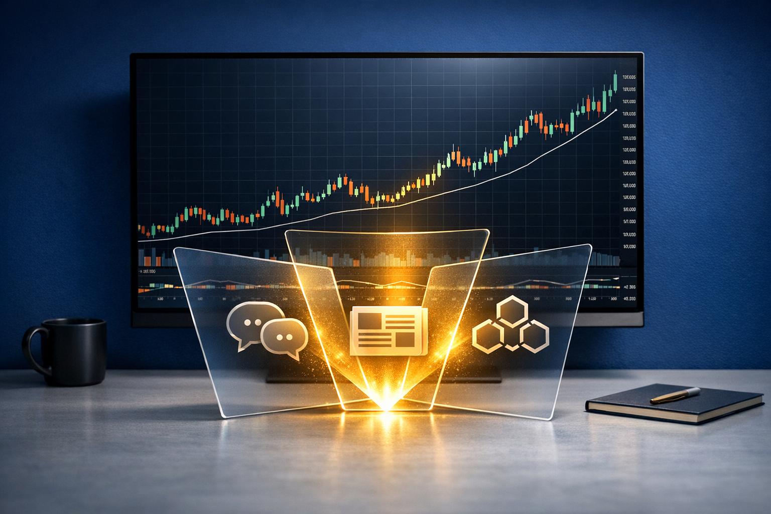
AI Tools: Platforms like StockioAI enhance analysis with real-time signals, pattern recognition, and risk management features.
Mastering these basics, combined with tools like AI, can help you navigate the volatile crypto market and make smarter trading decisions.
Main Types of Crypto Charts and Their Parts
Candlestick, Line, and Bar Charts
Candlestick charts pack a lot of information into a single visual. Each "candle" represents the open, close, high, and low prices for a specific period. The body of the candle shows the range between the opening and closing prices, while the thin lines - known as wicks or shadows - mark the highest and lowest points reached during that time. Colors do the heavy lifting here: green (or white) candles indicate a bullish period (price closed higher than it opened), while red (or black) candles signal a bearish period (price closed lower than it opened). This format makes it easier to quickly gauge market sentiment.
Line charts, on the other hand, strip things down to the basics. They connect closing prices over time with a single continuous line. This simplicity makes them perfect for spotting long-term trends without getting bogged down by the noise of intra-period price swings. If you’re looking for a clean, straightforward way to track overall market direction, line charts are a go-to choice.
Bar charts also represent the four key price points - open, close, high, and low - but without the color coding of candlestick charts. Each bar has a vertical line showing the high-to-low range, with small horizontal ticks on the left and right marking the opening and closing prices. While less visually intuitive than candlestick charts, bar charts still offer valuable insights for traders who prefer a more stripped-back approach.
Now that the chart types are clear, let’s break down the key components that make these charts functional and informative.
Basic Chart Parts
Crypto charts typically include several essential elements. At the top, you’ll find the trading pair (e.g., BTC/USD), the current price (usually displayed in U.S. dollars), and the 24-hour price change, shown both as a dollar amount and a percentage. This gives traders a quick snapshot of market activity.
You’ll also see the high and low prices for the selected timeframe - whether it’s daily, weekly, or monthly. These figures provide context about the asset’s trading range and volatility, helping traders assess its price behavior over time.
Market capitalization, another key metric, is often displayed prominently. For example, established cryptocurrencies like Bitcoin might show market caps in the hundreds of billions, while smaller assets might only reach the millions. This data offers a sense of the asset’s size and relative stability.
The time axis, usually along the bottom of the chart, organizes data by date and time. For daily views, dates are formatted as MM/DD/YYYY, while intraday views use HH:MM AM/PM. This layout makes it easy to zoom in or out depending on your trading strategy.
But price and time are just the beginning. Volume indicators add another layer of depth to chart analysis.
Volume Indicators
Volume bars, typically found at the bottom of crypto charts, show how many coins or tokens were traded during each time period. These bars are a powerful tool for understanding the relationship between trading activity and price movements.
When prices rise alongside increasing volume, it often signals strong buying interest and confirms the upward trend. Conversely, if prices climb but volume remains low, the momentum may be weak, and the trend could reverse quickly.
Volume can also reveal different market phases. For instance, during an accumulation phase, prices might move sideways while volume steadily grows, suggesting that savvy traders are building positions. In contrast, during a distribution phase, rising volume with steady or slightly increasing prices might indicate that holders are selling into strength.
Sharp spikes in volume often precede significant price movements, making them a useful early warning signal. Many charts also include a volume-weighted average price (VWAP) line, which calculates the session's average price weighted by trading volume. This tool can help traders pinpoint better entry or exit points, adding another layer of strategy to their decisions.
How to Read Trends, Support, and Resistance
Finding Price Trends
Price trends highlight the general direction in which a cryptocurrency's value moves over time. An uptrend is marked by a series of higher highs and higher lows - each peak surpasses the previous one, and each dip doesn't fall as low as the last. Conversely, a downtrend shows lower highs and lower lows, with each peak and dip sinking further. A sideways trend occurs when prices fluctuate within a relatively flat range, lacking a clear upward or downward direction.
To identify trends, connect the highs and lows of price movements. For example, if Bitcoin rises from $35,000 to $40,000, dips to $37,000, and then climbs to $42,000, this pattern confirms an uptrend. A rising trading volume during these movements strengthens the trend's reliability.
Keep in mind that trends can vary depending on the timeframe. Short-term trends on hourly or daily charts may not align with the bigger picture seen on weekly or monthly charts.
Support and Resistance Levels
Support levels act as a safety net, where buying activity tends to increase, preventing prices from dropping further. On the other hand, resistance levels serve as a barrier, where selling pressure intensifies, stopping prices from climbing higher. These levels often form when a cryptocurrency repeatedly bounces off specific price points, creating psychological benchmarks in the market.
To draw support and resistance levels, connect multiple points where prices have reversed direction. Support lines link the lows, while resistance lines connect the highs. These lines can either be horizontal, representing fixed price levels (e.g., $40,000 for Bitcoin), or sloped, following the angle of a trend.
Here's an example: If Ethereum repeatedly approaches $2,500 but fails to rise above it, that price becomes a resistance level. If Ethereum eventually breaks through $2,500 with strong trading volume, the resistance might flip into a support level, indicating that future price dips could attract buyers near that zone.
Volume plays a key role in confirming the strength of these levels. A significant increase in volume during a breakout or rebound suggests the level is robust. For instance, if a cryptocurrency bounces off a support line with rising volume, it signals that the level is holding firm.
Traders often use these levels to guide their decisions, placing buy orders near support and sell orders near resistance. However, false breakouts - where prices temporarily move beyond these levels before reversing - can occur. To avoid being misled, traders rely on volume confirmation and continued price movement to validate the breakout.
AI Pattern Recognition
StockioAI employs advanced algorithms to analyze charts, identifying trends, support, and resistance by processing large amounts of historical price and volume data. These algorithms detect patterns like double bottoms, head and shoulders, and triangle consolidations near critical levels, offering traders insights with higher probabilities of success.
The AI system continuously monitors price changes across various timeframes, alerting traders to emerging trends or significant movements near support and resistance zones. For instance, if Bitcoin starts forming higher lows while volume patterns suggest accumulation, StockioAI can flag this as an early indicator of an uptrend.
This technology enhances the manual techniques discussed earlier by providing continuous, objective updates tailored to evolving market conditions. As cryptocurrency markets shift and new patterns develop, StockioAI updates its algorithms to stay accurate in dynamic trading environments. This reduces the guesswork involved in manual analysis, delivering consistent, data-driven insights for both beginners and seasoned traders.
Real-time alerts ensure traders stay informed. For example, if a cryptocurrency breaks through a major resistance level with strong volume or if support begins to weaken, StockioAI notifies users immediately, enabling quick decision-making in response to market changes.
Next, let’s dive into key technical indicators that can further refine your crypto trading strategies.
How to Read Crypto Charts (Repeatable Chart Analysis Guide)
Key Technical Indicators for Crypto Trading
Technical indicators are tools that help traders analyze price movements, trading volume, and market volatility. These tools can identify trends, signal potential reversals, and provide insight into market behavior. Broadly, they fall into three categories: oscillators, trend indicators, and volume indicators [2].
It’s important to note that no single indicator guarantees accuracy. The best approach combines multiple tools while considering market context and practicing solid risk management. Using indicators that duplicate the same data can lead to unnecessary confusion, so diversifying your toolkit is key [2][5][6][7]. Building on chart patterns and volume analysis, these indicators can sharpen your market insights.
Relative Strength Index (RSI)
The Relative Strength Index (RSI) measures momentum and ranges between 0 and 100 [2][5]. When RSI readings exceed 70, the asset is considered overbought; readings below 30 suggest oversold conditions. A crossover of the 50 mark often signals a shift in momentum. Additionally, if price movement diverges from RSI trends, it can indicate an upcoming reversal.
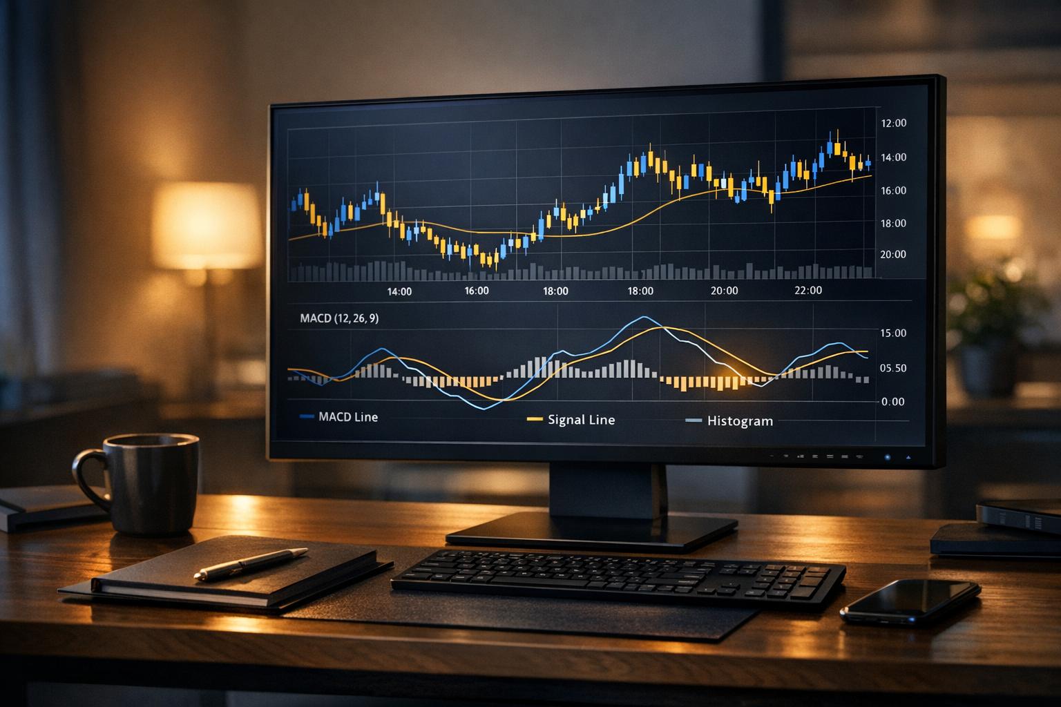
Moving Average Convergence Divergence (MACD)
MACD is a momentum-based indicator that evaluates trend strength [2][3][5]. It consists of three components: the MACD Line (calculated by subtracting the 26-day EMA from the 12-day EMA), the Signal Line (a 9-day EMA of the MACD Line), and the Histogram (the difference between the MACD Line and Signal Line). A bullish crossover - when the MACD Line moves above the Signal Line - indicates upward momentum, while a bearish crossover suggests a potential downturn.
Bollinger Bands
Bollinger Bands help traders assess market volatility. They consist of a 20-period SMA (simple moving average) with two outer bands set two standard deviations away from the SMA [4][6]. During periods of high volatility, the bands widen, while calmer markets cause them to contract. When the price touches the upper band, it may signal overbought conditions, whereas contact with the lower band suggests oversold conditions. A "Bollinger Band squeeze", where the bands contract significantly, often precedes a breakout.
Volume Indicators and AI-Generated Signals
Volume indicators measure the strength of price movements by analyzing trading volume. For example, On-Balance Volume (OBV) sums up the volume on up-days and subtracts it on down-days, revealing whether money is flowing into or out of an asset. The Volume Weighted Average Price (VWAP) calculates the average price weighted by volume, with prices above VWAP signaling bullish sentiment and prices below it indicating bearish sentiment.
At StockioAI, these volume indicators are paired with price data to produce actionable BUY, SELL, and HOLD signals. The system monitors unusual volume spikes, divergences, and patterns across multiple timeframes, delivering real-time alerts. This helps traders avoid impulsive decisions, especially during volatile market conditions.
| Indicator | Key Signals | Best Used For | Combine With |
|---|---|---|---|
| RSI | Above 70 (overbought), Below 30 (oversold), Divergences | Momentum analysis, Entry/exit timing | Moving averages, MACD, Trendlines |
| MACD | Bullish/bearish crossovers, Histogram changes | Trend changes, Momentum shifts | RSI, Bollinger Bands, Volume |
| Bollinger Bands | Band touches, Squeezes, Breakouts | Volatility analysis, Breakout trading | RSI, MACD, Volume indicators |
| Volume Indicators | Volume spikes, OBV trends, VWAP levels | Confirming price moves, Trend strength | All technical indicators |
How to Spot and Read Chart Patterns
Chart patterns are recognizable shapes on price charts that reflect historical price movements, helping traders anticipate future market trends [8][9]. By learning to identify these patterns, you can strengthen your market analysis and make quicker, more confident decisions - especially during volatile conditions.
Common Chart Patterns
Head and Shoulders patterns often indicate a potential reversal in trend. This setup consists of three peaks: a higher central peak (the "head") and two lower peaks on either side (the "shoulders"). When the price drops below the "neckline" connecting the two troughs, it usually signals a bearish reversal. For example, imagine Bitcoin forming this pattern with peaks at $45,000, $50,000, and $44,000. If the price breaks below the $42,000 neckline, it could suggest further downward movement.
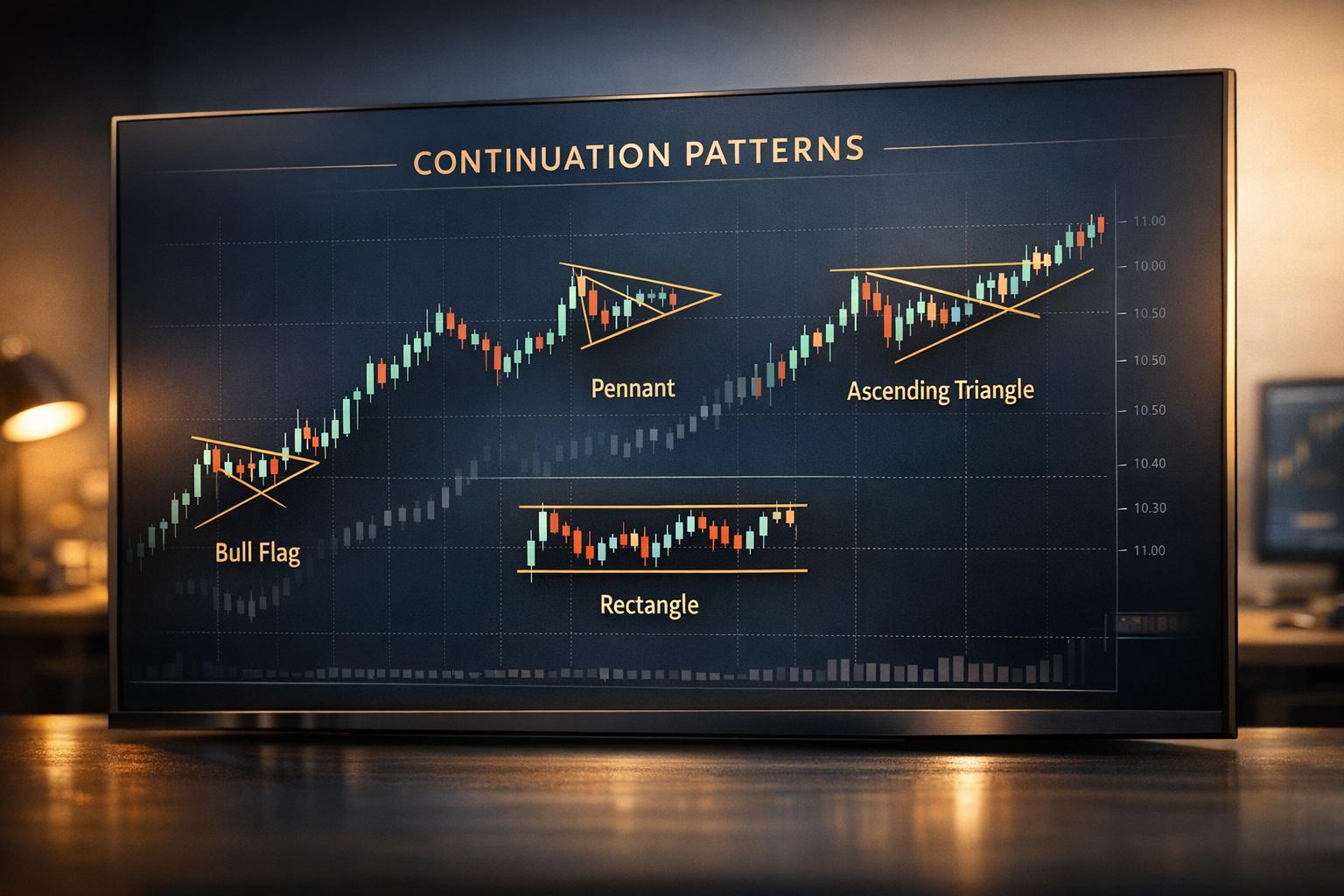
Triangle patterns show periods of consolidation before a breakout. There are three main types:
-
Ascending triangles have a flat resistance line and rising support, hinting at bullish momentum.
-
Descending triangles feature a flat support line with falling resistance, pointing to bearish pressure.
-
Symmetrical triangles involve converging trendlines and can lead to breakouts in either direction.
Volume typically decreases during the formation of a triangle and then spikes during the breakout, confirming the pattern's validity.
Flag and Pennant patterns represent short pauses during strong trends. Flags look like small rectangular consolidations that slope against the prevailing trend, while pennants form tiny symmetrical triangles. Both patterns generally resolve in the direction of the original trend. For instance, if Ethereum surges from $2,000 to $2,800 and forms a flag pattern between $2,700 and $2,750, it often signals another upward move.
Breakouts and Trade Signals
When analyzing chart patterns, focus on three key elements: pattern completion, volume confirmation, and price targets.
-
Pattern completion happens when prices break through established boundaries with clear momentum.
-
Volume confirmation is crucial - breakouts should come with a noticeable volume increase, ideally 50% or more above the recent average, to validate the move.
-
Price targets can be estimated by measuring the height of the pattern and projecting it from the breakout point.
Be cautious of false breakouts, where prices temporarily move beyond pattern boundaries only to reverse. To avoid these traps, wait for a sustained move with strong volume. A helpful guideline: the longer it takes for a pattern to form, the more impactful the breakout is likely to be.
AI-Assisted Pattern Recognition
Tools like StockioAI are changing the game in pattern recognition. These algorithms scan multiple timeframes simultaneously, identifying emerging patterns before they fully form. By analyzing thousands of historical examples, StockioAI calculates success probabilities for each pattern, giving traders a clearer sense of potential outcomes. For instance, if a head and shoulders pattern starts to develop, StockioAI alerts users and updates its probability scores as the pattern progresses.
The system also learns from past failures. If ascending triangles in a specific cryptocurrency repeatedly fail to break upward, StockioAI incorporates this data into future analyses, refining its accuracy over time. This adaptive approach helps traders avoid common mistakes in pattern interpretation.
With these visual tools in mind, the next section will dive into how advanced AI systems further enhance pattern detection, delivering actionable insights for trading strategies.
How to Use StockioAI for Chart Analysis
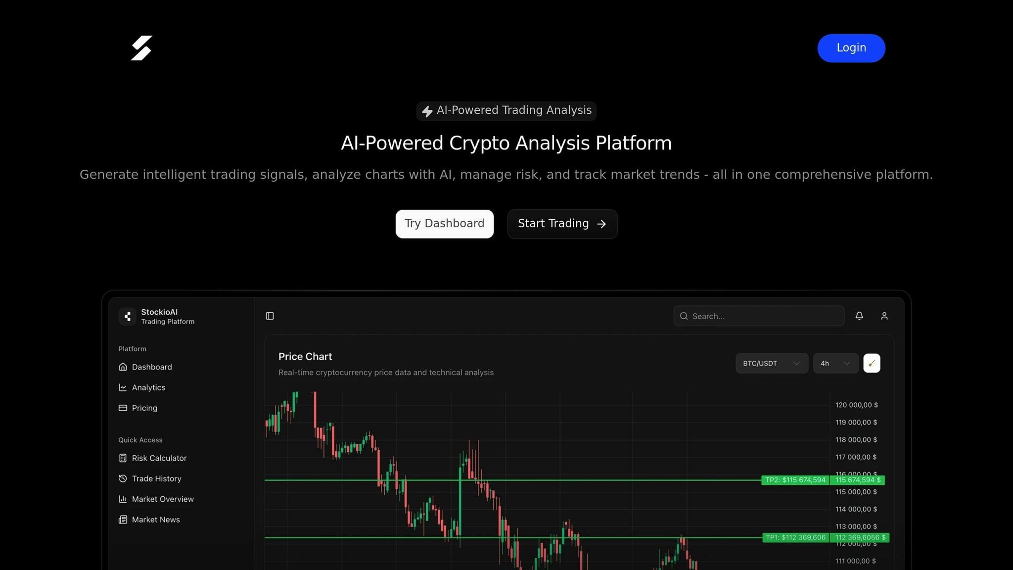
StockioAI builds on the principles of technical analysis and simplifies chart analysis with its AI-powered insights. By analyzing 60 real-time data points every second[1], it delivers actionable trading signals. These data points include technical indicators, volume patterns, support levels, market sentiment, order book depth, whale movements, and even trends from social media. The result? Clear, real-time trading guidance that takes the guesswork out of chart analysis.
Setting Up and Customizing Charts
Once logged in, the main dashboard provides access to interactive charts where you can select cryptocurrency pairs and adjust timeframes to match your trading strategy. Timeframes range from 1-minute to weekly intervals, allowing for both short-term and long-term analysis.
You can layer multiple technical indicators like RSI, MACD, Bollinger Bands, and volume indicators onto your charts for a more detailed view. StockioAI also offers an AI-generated trading levels feature, which automatically marks support and resistance zones on your charts and updates them in real time as market conditions shift.
Customization is seamless. Save your preferred chart setups as templates to quickly apply them across multiple cryptocurrency pairs. Each time you log in, your saved configurations will load automatically, ensuring a consistent and personalized experience.
Reading AI-Generated Signals
StockioAI simplifies decision-making by generating clear BUY, SELL, and HOLD signals. Each signal comes with suggested entry points, stop-loss levels, and profit targets, all backed by a confidence score derived from historical data.
BUY signals include recommended entry and exit levels, along with a confidence score based on past pattern analysis. SELL signals follow the same logic, while HOLD signals appear when the system detects sideways market movement or insufficient data for a strong directional call. Every signal is accompanied by a detailed explanation, referencing specific technical indicators, volume trends, or sentiment analysis. These signals integrate seamlessly with the platform's risk management tools, helping traders make informed choices.
Risk Calculators and Portfolio Tracking
The Risk Calculator is a handy tool for determining position sizes based on your account balance and risk tolerance. Meanwhile, the Portfolio Tracking feature aggregates data from multiple exchanges, giving you a comprehensive view of your holdings, allocations, and overall performance.
Position Tracking allows you to monitor trades in real time, with instant profit and loss (P&L) updates. You can track performance against your targets and receive alerts as trades approach stop-loss or take-profit levels.
The platform’s portfolio tracking goes a step further by providing a complete snapshot of your cryptocurrency holdings. It connects to multiple exchanges via APIs, offering insights into overall allocation, sector exposure, and performance metrics. You can even set alerts for major changes or rebalancing opportunities.
To round out your analysis, the Market Overview section highlights trending cryptocurrencies, sentiment analysis, and sector performance data. The integrated Market News Feed keeps you informed of major events like regulatory updates, partnerships, or technical advancements, ensuring your trading decisions are backed by both technical and fundamental insights.
Conclusion
Reading crypto charts effectively requires a solid grasp of chart types, an ability to spot key patterns, and a strategic use of technical indicators to inform trading decisions. Earlier, we explored various chart types and volume indicators that form the foundation of this process.
At the heart of successful chart analysis lies the skill to pinpoint support and resistance levels. These critical price zones, when combined with trend analysis, help traders anticipate market movements and refine their entry and exit strategies. Adding tools like RSI, MACD, and Bollinger Bands provides a broader perspective, making it easier to identify potential reversal points and understand market conditions. This comprehensive approach also sets the stage for integrating AI into modern trading practices.
Chart patterns are another essential element, offering insights into shifts in market dynamics. Recognizing formations like head and shoulders, triangles, or double tops can signal significant price changes ahead. While manually identifying these patterns can be both time-intensive and prone to mistakes, AI-powered tools have stepped in to simplify and speed up the process. Platforms like StockioAI, for instance, analyze real-time data to deliver actionable BUY, SELL, and HOLD signals, making complex analysis more accessible to traders.
The crypto market’s 24/7 volatility poses a unique challenge, as constant monitoring is nearly impossible for individuals. AI-assisted tools help bridge this gap by providing continuous oversight, sending instant alerts when key patterns form or technical levels are breached.
That said, no analysis - no matter how precise - can eliminate risk entirely. Using resources like position sizing calculators and portfolio tracking tools is crucial for safeguarding your capital. As markets continue to evolve, combining disciplined risk management with AI-driven insights can enhance decision-making and reduce emotional pitfalls.
FAQs
How can I use RSI and MACD to make better trading decisions in crypto?
You can combine the RSI (Relative Strength Index) and MACD (Moving Average Convergence Divergence) to sharpen your crypto trading strategy by merging momentum and trend insights. Here's how it works: a potential buy signal might appear when the MACD line crosses above its signal line while the RSI dips below 30. This suggests the asset is oversold and could be gearing up for an upward move. Conversely, a potential sell signal can occur when the MACD line crosses below its signal line and the RSI rises above 70, pointing to overbought conditions.
Using these two indicators together allows you to confirm trend reversals more effectively and pinpoint better entry and exit opportunities. This combination can help filter out false alarms and enhance your decision-making process. However, always keep the broader market environment in mind and rely on additional tools to validate your findings.
What are the advantages of using AI tools like StockioAI to analyze cryptocurrency charts?
AI tools such as StockioAI simplify cryptocurrency chart analysis by quickly processing massive datasets and delivering precise insights. These tools can uncover trends, patterns, and critical market signals, empowering traders to make informed, data-backed decisions in the ever-changing world of crypto.
By automating tasks like risk assessment and pattern detection, AI minimizes emotional decision-making and boosts trading efficiency. This means traders can adapt more effectively to market shifts, saving valuable time while building greater confidence in their strategies.
What role do support and resistance levels play in cryptocurrency trading?
Support and resistance levels are essential tools in cryptocurrency trading, offering insights into potential price movements. Support levels act like a safety net - a point where buying interest typically increases, preventing prices from falling further. These levels often present strong opportunities for traders looking to enter the market. In contrast, resistance levels function as a barrier or "ceiling", where selling pressure tends to build up, causing prices to pause or reverse. This makes them a common signal for traders to sell or secure profits.
When prices break through these levels, it can indicate a change in market sentiment. For example, if a support level is breached, it might transform into a new resistance level, and the reverse is also true. Recognizing these shifts allows traders to adjust their strategies and make better-informed trading decisions.