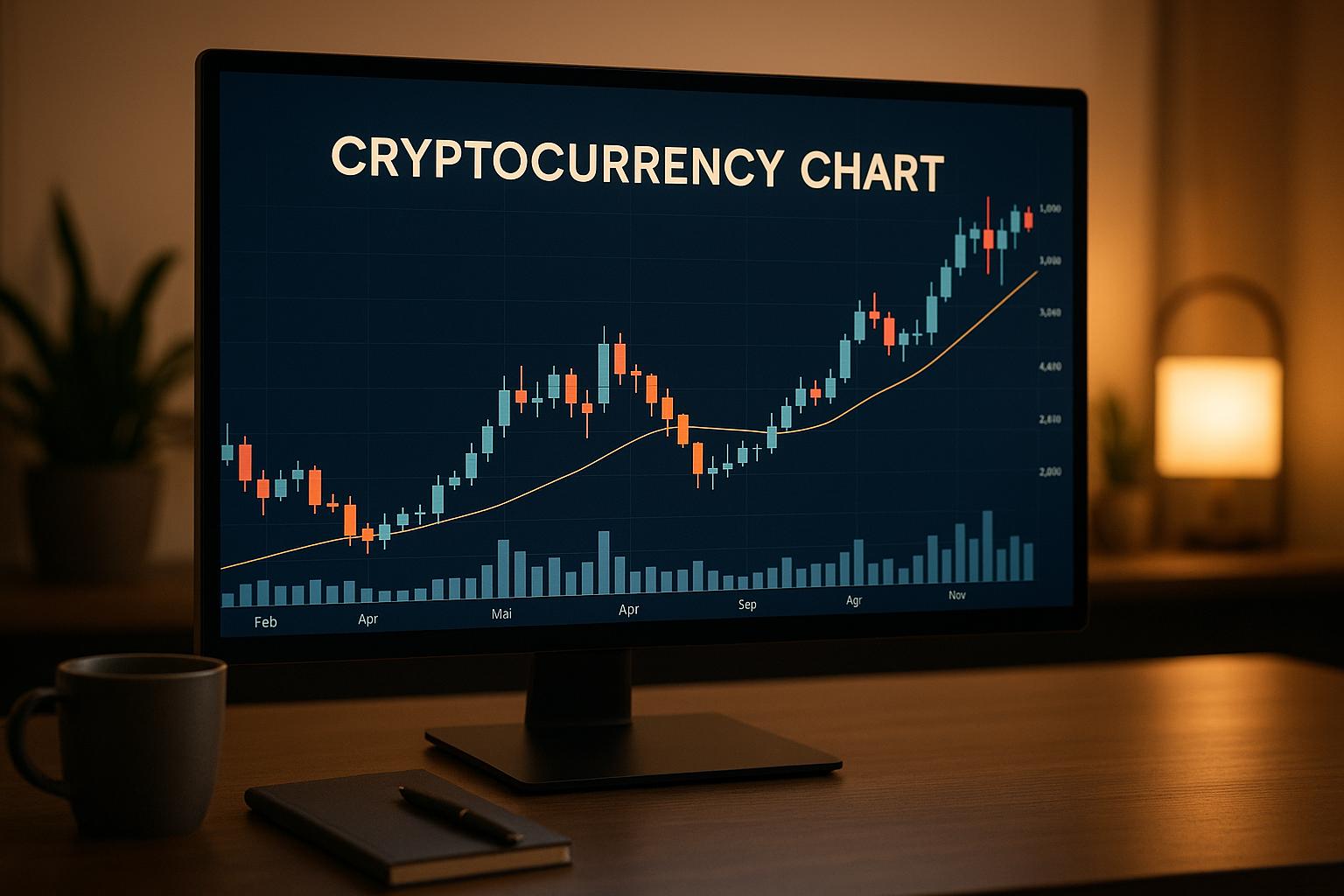
Cryptocurrency charts help traders track price movements, identify trends, and make informed decisions. They display price (vertical axis) and time (horizontal axis), along with trading volumes. Charts like line, bar, and candlestick offer varying levels of detail, while technical indicators like RSI, MACD, and moving averages provide deeper insights into market behavior.
Key takeaways:
- Charts show price trends: Uptrends (higher highs/lows), downtrends (lower highs/lows), and sideways movements.
- Identify support/resistance: Key price zones where markets often reverse or pause.
- Understand chart types: Candlesticks are widely used for their detailed visual representation.
- Use technical indicators: Tools like RSI and MACD help spot momentum and potential reversals.
- Risk management: Set stop-loss and take-profit levels based on chart data.
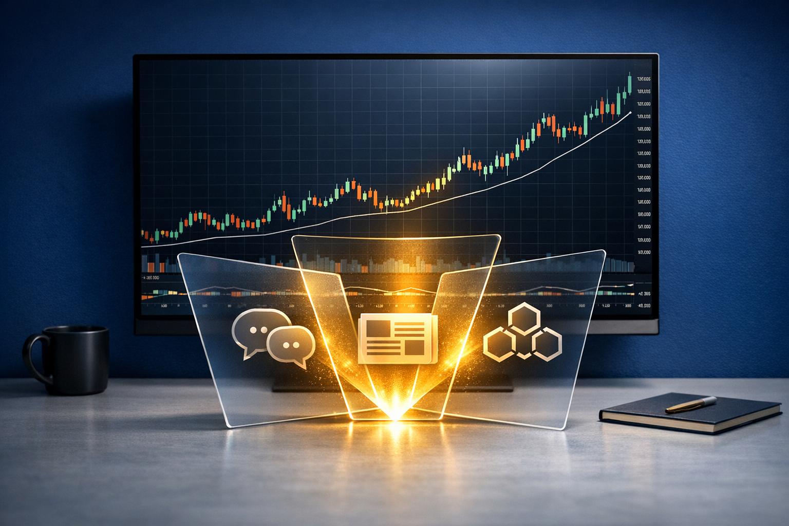
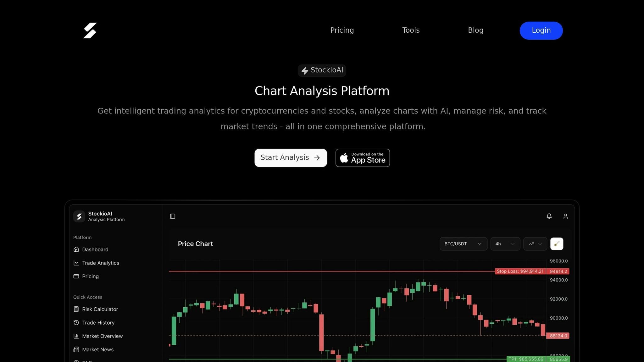
AI tools like StockioAI simplify analysis by offering clear Buy, Sell, or Hold signals, combining multiple indicators and patterns for better decision-making. While charts are powerful, external factors like news or low liquidity can affect their reliability. Always combine chart insights with broader market awareness.
Crypto Chart Analysis for Beginners (How to Read Crypto Charts)
Basic Chart Components
Grasping the key elements of cryptocurrency charts is crucial for understanding market movements. Each chart is built on fundamental components that illustrate price behavior. Let’s break these down so you can confidently read any crypto chart and start identifying patterns, trends, and technical signals.
Chart Axes and Time Periods
At the heart of every cryptocurrency chart are two axes that organize price and time data. The horizontal X-axis represents time, moving from left to right, while the vertical Y-axis shows price levels in US dollars, reflecting the value of a crypto asset at any given moment.
Charts can display different time intervals depending on your trading strategy. For short-term moves, traders often use 1-, 5-, or 15-minute charts. For broader trends, 1- or 4-hour charts are popular, while daily or weekly charts are ideal for long-term analysis. Each data point corresponds to one chosen time interval.
The price axis can use two types of scales:
- Arithmetic scale: Equal spacing represents equal dollar changes.
- Logarithmic scale: Equal spacing reflects identical percentage changes, making it easier to compare proportional price moves, whether they occur at $1,000 or $50,000.
Longer timeframes tend to smooth out short-term price fluctuations, offering more reliable insights. For example, a trend visible on a daily chart carries more weight than one seen only on a 5-minute chart. Many traders use multiple timeframe analysis to refine their strategies - starting with higher timeframes like daily or weekly charts to identify overarching trends, then zooming into lower timeframes like 1-hour or 4-hour charts for precise entry and exit points.
Chart Types Explained
Cryptocurrency platforms provide several chart formats, each with its own way of displaying price data:
- Line charts: Simple and clean, line charts connect closing prices over time, offering a quick snapshot of price movement. They’re ideal for comparing multiple cryptocurrencies but lack detail, as they omit open, high, and low prices.
- Bar charts: These offer more depth. Each vertical bar represents a time period, with the top marking the highest price, the bottom showing the lowest, and small horizontal ticks indicating the opening (left tick) and closing (right tick) prices. Bar charts provide a fuller picture of price action.
- Candlestick charts: The most widely used format among traders, candlestick charts display the same four price points as bar charts - open, high, low, and close - but in a more visually intuitive way. The rectangular "body" shows the range between opening and closing prices, while thin lines called "wicks" or "shadows" extend to the period’s highest and lowest prices. Color-coding enhances clarity: green (or white) indicates a price increase, while red (or black) shows a decrease. Candlestick charts are favored for their ability to highlight trends and patterns clearly.
Candlesticks and Volume
Candlesticks, combined with volume data, provide a deeper look into market dynamics. Each candlestick represents price action within its time period:
- The body reflects the difference between the opening and closing prices. A green candlestick shows the price closed higher than it opened (buying pressure), while a red candlestick indicates the opposite (selling pressure).
- The wicks reveal the highest and lowest prices reached during the period. A long upper wick suggests buyers pushed prices higher, but sellers regained control, signaling resistance. Conversely, a long lower wick shows sellers drove prices down, but buyers stepped in, indicating support.
The size of the candlestick body also tells a story. Long bodies indicate strong momentum - either aggressive buying or selling - while short bodies suggest indecision, with neither side dominating. A candlestick with almost no body, known as a Doji, signals a temporary balance between buyers and sellers and often precedes a shift in momentum.
Below the price chart, volume bars display the amount of trading activity during each period, often measured in the number of coins traded or their dollar value. Volume is a key factor in assessing the strength of price movements. For instance, a breakout accompanied by high volume is more likely to be reliable than one with low volume. On the other hand, a strong price move with weak volume may indicate a lack of conviction, increasing the chance of a reversal. Volume helps distinguish meaningful trends from short-lived noise.
Patterns, Trends, and Price Levels
Now that we've covered the basics, let's dive into identifying chart patterns that can help predict price movements. Markets don’t move randomly - they follow trends and form patterns that traders use to anticipate future movements. Spotting these early can give you an edge, whether you're looking to seize opportunities or avoid losses. These patterns are built on fundamental chart elements, connecting price behavior to actionable trading strategies.
Market Trends and Structure
A trend represents the overall direction of an asset's price over time. Trading in the same direction as the trend - rather than against it - can significantly improve your chances of success. Markets generally move in one of three directions: upward, downward, or sideways.
- Uptrend: This happens when prices consistently create higher highs and higher lows. For instance, if Bitcoin climbs from $40,000 to $45,000, dips to $42,000, and then rallies to $48,000, you’re observing an uptrend. Both peaks and valleys are rising, signaling strong buying interest.
- Downtrend: This is the reverse - prices make lower highs and lower lows. For example, if Ethereum falls from $3,000 to $2,700, bounces to $2,800, and then drops to $2,500, the pattern indicates consistent selling pressure.
- Sideways Market: Also known as consolidation or range-bound trading, this occurs when prices move horizontally between defined upper and lower limits. The price repeatedly bounces within these boundaries, reflecting a balance between buyers and sellers. Sideways markets often precede significant breakouts in either direction.
To identify trends, observe the sequence of price swings. Mark the swing highs (local peaks) and swing lows (local troughs) on your chart. If each new swing high is higher than the last and each swing low is also higher, you're in an uptrend. Conversely, lower highs and lower lows signal a downtrend. If swings remain within a tight range without clear progression, the market is moving sideways.
Analyzing trends across multiple timeframes can provide additional context, helping you refine your timing and strategy.
Support, Resistance, and Trend Lines
Once you’ve identified the trend, the next step is to pinpoint key price zones where the market tends to reverse or pause. These are known as support and resistance levels, which act as psychological barriers for price movement.
- Support: This is a price level where demand is strong enough to prevent further declines. Think of it as a floor that catches falling prices. For example, if Ethereum repeatedly bounces off $2,500, that level becomes a recognized support zone. The more times this level holds, the stronger it is perceived to be.
- Resistance: This is the opposite - a ceiling where selling pressure outweighs buying interest. If Bitcoin struggles to break above $50,000 multiple times, that level becomes established resistance.
These levels aren’t exact numbers but rather zones, often spanning a small range. For instance, support might lie between $2,480 and $2,520 rather than exactly at $2,500.
An important concept is role reversal: when a support level is broken, it often turns into resistance, and vice versa. For instance, if Bitcoin breaks above $50,000 and continues higher, that level may act as support if prices pull back to test it from above.
Trend lines are another valuable tool for visualizing the direction and strength of a trend. In an uptrend, draw a line connecting two or more swing lows to create an upward trend line. As long as prices stay above this line, the uptrend remains intact. In a downtrend, connect two or more swing highs to form a downward trend line.
The angle of a trend line can reveal momentum. Steeper lines indicate aggressive price movement but are less sustainable and more prone to breaks. Gentler slopes suggest steadier trends that are more likely to hold. When prices break through a trend line - especially with high trading volume - it often signals a potential reversal or a pause in the current trend.
Channels are formed when you can draw parallel trend lines above and below price action. These help identify potential entry and exit points:
- Ascending channels contain an uptrend between two upward-sloping lines.
- Descending channels frame a downtrend within parallel downward-sloping lines.
- Horizontal channels capture sideways movement.
Common Price Patterns
Recurring price patterns on cryptocurrency charts provide valuable clues about future market behavior. These patterns reflect collective trader behavior and can signal whether a trend is likely to continue or reverse.
-
Double Tops and Double Bottoms: These are reversal patterns. A double top forms after an uptrend when prices hit resistance twice at roughly the same level, creating two peaks with a valley in between. When prices break below the valley’s low (the "neckline"), it signals a likely downtrend. A double bottom is the reverse - two troughs at similar levels separated by a peak - indicating a potential upward reversal.
-
Head and Shoulders: This is a classic reversal pattern. It features three peaks: a taller middle peak (the head) flanked by two shorter peaks (the shoulders). When the neckline connecting the two valleys is broken, it confirms the pattern, signaling a downtrend. An inverse head and shoulders appears at the bottom of a downtrend, signaling a potential upward reversal.
-
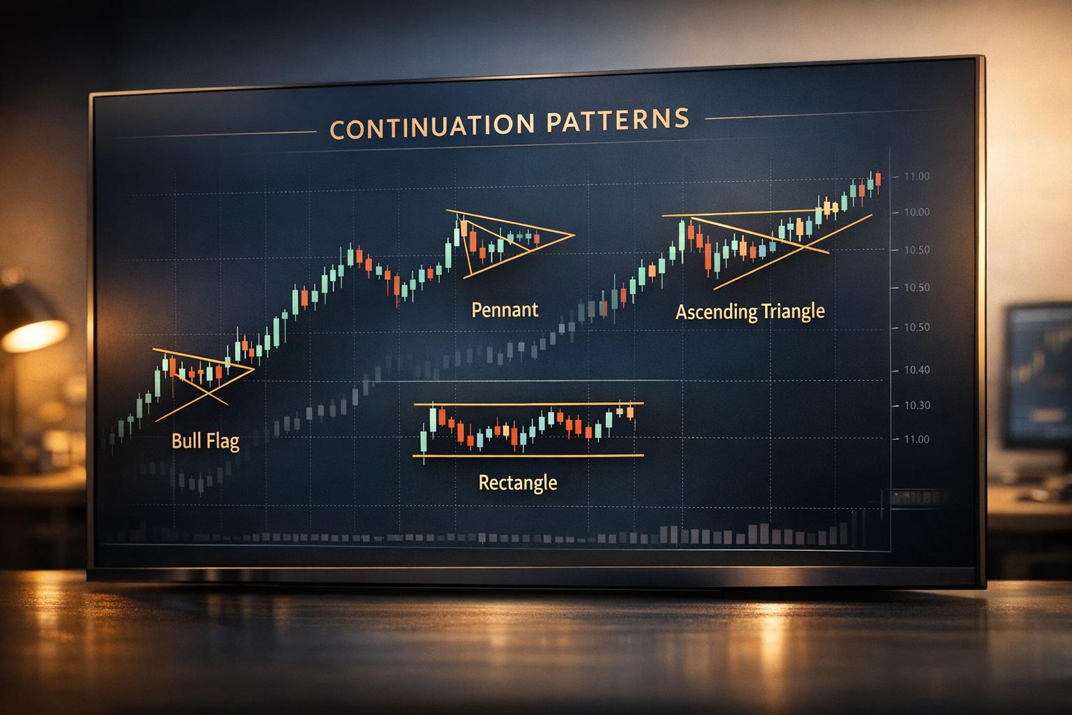
Triangles: These are continuation patterns that typically resolve in the direction of the prior trend.
- Symmetrical triangles form when prices make lower highs and higher lows, with trend lines converging toward an apex.
- Ascending triangles have a flat top (resistance) and rising lows, often breaking upward.
- Descending triangles feature a flat bottom (support) and declining highs, often breaking downward.
-
Flags and Pennants: These are short-term continuation patterns that appear after sharp price movements. A flag resembles a small rectangle tilted against the prior trend, while a pennant looks like a tiny symmetrical triangle. Both suggest the market is pausing briefly before continuing in the original direction.
-
Wedges: These resemble triangles but have both trend lines sloping in the same direction. A rising wedge forms in an uptrend and often signals a downward reversal, while a falling wedge forms in a downtrend and typically resolves with an upward breakout.
Recognizing these patterns takes practice. The key is to identify the structure early, wait for confirmation through a breakout accompanied by strong volume, and remember that no pattern guarantees a specific outcome. Patterns are most effective when used alongside other tools like support and resistance levels, volume analysis, and technical indicators. Be cautious of false breakouts, where prices briefly breach a pattern boundary before reversing. Patience and confirmation are essential for making informed trading decisions.
Technical Indicators and AI Tools
Patterns and trend lines give you a visual sense of price behavior, but technical indicators take things a step further by adding mathematical precision. These tools analyze price and volume data to provide signals about momentum, trend strength, and potential reversals. AI-powered platforms simplify this process, offering clear trading signals to guide your decisions.
Main Technical Indicators
Technical indicators turn raw price data into useful insights, helping traders make decisions without letting emotions cloud their judgment. Here are some of the most popular ones used in cryptocurrency trading:
Moving Averages help smooth out price fluctuations, making it easier to identify the overall trend. The Simple Moving Average (SMA) calculates the average closing price over a set time frame - like a 50-day SMA, which averages the last 50 closing prices. The Exponential Moving Average (EMA), on the other hand, gives more weight to recent prices, making it quicker to respond to market changes. Traders often watch for "crossovers": when a shorter moving average (like a 50-day) moves above a longer one (like a 200-day), it can signal an uptrend. A downward crossover might suggest weakening momentum.
The Relative Strength Index (RSI) measures momentum on a scale of 0 to 100, comparing recent gains to losses. If the RSI goes above 70, the asset might be overbought - prices may have risen too quickly and could pull back. If it drops below 30, the asset could be oversold, with prices possibly due for a rebound. However, in strong trends, RSI can stay in extreme zones for a while, so it works best when paired with other tools.
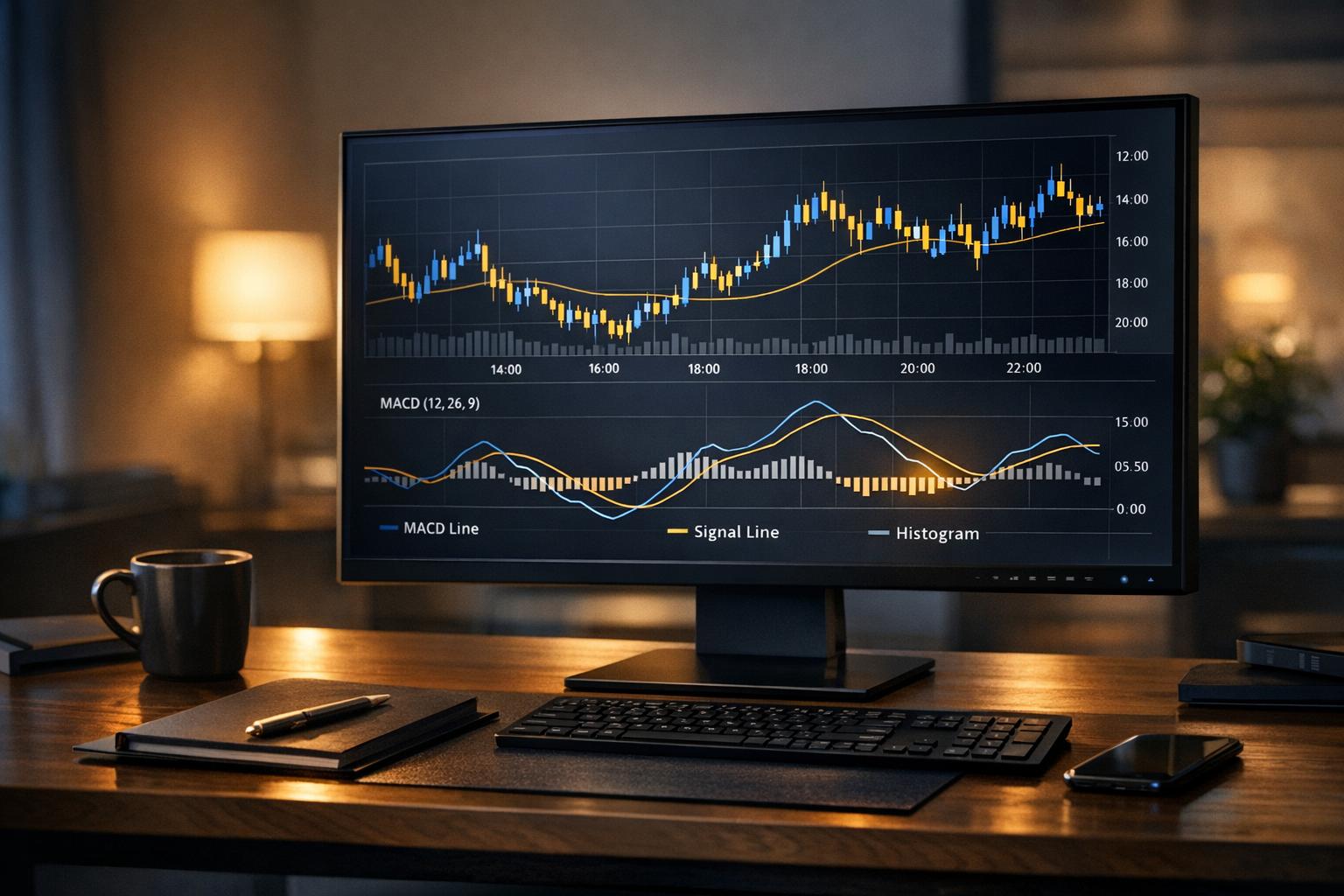
Moving Average Convergence Divergence (MACD) examines the relationship between two EMAs to spot momentum shifts. It includes the MACD line (the difference between 12-period and 26-period EMAs), a signal line (a 9-period EMA of the MACD line), and a histogram showing the gap between the two. Crossovers between the MACD line and the signal line suggest momentum changes, while divergences between MACD and price action can hint at possible reversals.
Bollinger Bands consist of three lines: a middle one (usually a 20-period SMA) and two outer bands set two standard deviations above and below it. These bands expand with volatility and contain prices about 95% of the time. When prices touch the upper band, the asset might be overbought; if they hit the lower band, it could be oversold. A common strategy is to watch for "squeezes" - when the bands narrow, signaling a potential sharp price move.
Using multiple indicators together can provide stronger confirmation. For example, if RSI shows oversold conditions, MACD signals a bullish crossover, and the price bounces off a support level, this combination offers more confidence than relying on a single indicator.
These technical signals lay the groundwork for AI tools that refine and enhance chart analysis.
AI-Powered Analysis with StockioAI
Traditional technical indicators require manual interpretation, which can be tricky in the fast-paced cryptocurrency market where signals often conflict. AI platforms like StockioAI tackle this challenge by analyzing multiple data points at once and delivering clear, actionable signals.
StockioAI uses artificial intelligence to provide Buy, Sell, and Hold signals based on a detailed evaluation of market conditions. Instead of juggling dozens of indicators yourself, the platform simplifies the process, synthesizing complex data into straightforward recommendations. This is especially useful in cryptocurrency trading, where prices can swing wildly in just a few hours.
The platform classifies the market into categories like trending, ranging, volatile, or calm. This matters because strategies that work in trending markets often fail in sideways conditions. By identifying the current market type, StockioAI helps traders adapt their approach instead of applying the same strategy across all situations.
StockioAI employs a 7-Tier Priority System that evaluates market structure, volume, momentum, and moving averages, prioritizing long-term factors over short-term fluctuations. This approach minimizes false signals and improves decision-making.
Another standout feature is its AI pattern recognition, which automatically identifies chart patterns like head and shoulders, triangles, and flags. This saves traders the time and effort of manually scanning charts and ensures they don’t miss key opportunities.
The platform offers different subscription tiers to fit various trading needs. A free plan provides five AI trading signals, while the Premium Access plan, priced at $79.99 per month or $24.99 per week, unlocks unlimited signals, automated analysis, and advanced features like real-time alerts, portfolio tracking, and priority support. Premium users also benefit from cryptocurrency chart updates every four hours for major assets like Bitcoin, Ethereum, Solana, and XRP, with daily analysis for popular stocks.
Analyzing Multiple Timeframes
Combining technical indicators and AI insights becomes even more powerful when you analyze multiple timeframes. Focusing on a single timeframe can lead to misinterpretation. For instance, a bullish signal on a 15-minute chart might look promising, but the daily chart could reveal a strong downtrend, making the short-term signal misleading.
Multiple timeframe analysis involves studying an asset across different periods, such as daily, four-hour, and one-hour charts. Generally, higher timeframes carry more weight. For example, if the daily chart shows an uptrend but the one-hour chart shows a pullback, the daily trend sets the broader context. That pullback might be a buying opportunity rather than a reversal.
StockioAI incorporates this concept with its Multi-Timeframe Analysis feature, ensuring higher timeframe trends take precedence over shorter ones. This prevents the platform from issuing bullish signals on shorter timeframes when the overall trend is bearish. By doing so, it helps traders avoid reacting to short-term noise and focus on the bigger picture.
The platform’s analysis schedule reflects this principle. Cryptocurrency charts are updated every four hours, balancing the need to stay current without overreacting to minor price swings. This timeframe captures meaningful changes without generating excessive signals from temporary volatility.
When analyzing multiple timeframes manually, consistency is key. Use the same indicators, like RSI or MACD, across all timeframes for easier comparison. Look for alignment - if multiple timeframes confirm the same signal, your confidence in that trade increases.
Shorter timeframes often produce more signals but also more false positives. For example, a one-minute chart may show dozens of trade opportunities in a day, but most won’t align with the broader trend. On the other hand, monthly charts provide reliable trend information but update too slowly for active trading. Most cryptocurrency traders find that a mix of daily, four-hour, and one-hour charts strikes the right balance between reliability and responsiveness.
Step-by-Step Chart Analysis
Building on the basics of chart components and pattern recognition, here’s how to conduct a practical chart analysis by blending manual techniques with AI-driven insights.
Chart Analysis Process
Start by selecting your trading pair and a timeframe that fits your strategy. Quickly evaluate the trend - are prices climbing with higher highs and lows (uptrend), falling with lower highs and lows (downtrend), or moving sideways (consolidation)? Identify key support and resistance zones by marking areas where prices have consistently bounced or stalled. Add trend lines by connecting swing highs or lows for a clearer picture of the market's direction.
Next, apply your chosen indicators. Tools like moving averages, RSI, and MACD can help confirm trends, but avoid cluttering your chart - stick to three to five well-considered tools for clarity.
Check the StockioAI signal. This platform analyzes multiple data points to provide a clear recommendation: Buy, Sell, or Hold. Compare this signal with your own findings. For example, if your analysis suggests an uptrend with strong support and bullish indicators, a Buy signal from StockioAI can reinforce your confidence. On the other hand, if the AI signal contradicts your view, it’s worth revisiting your analysis to ensure nothing was overlooked.
Look for confluence - when multiple factors align. For instance, if an asset is testing a support level, indicators like RSI and MACD show bullish momentum, and StockioAI confirms with a Buy signal, this alignment strengthens your case for taking action.
Document your strategy, including entry and exit points. This not only clarifies your plan but also provides a reference for refining your approach in the future.
Finally, incorporate risk management strategies to protect your trades and preserve your capital.
Risk Management Using Charts
Chart analysis isn’t just about spotting opportunities - it’s equally critical for managing risk. Every trade should be backed by a solid risk management plan.
Set your entry point based on chart behavior. Instead of jumping in at the first sign of a bullish signal, wait for confirmation. For example, if the price breaks above resistance, consider entering only after it closes above that level and retests it as new support. This helps avoid falling for false breakouts.
Define stop-loss and take-profit levels using chart-defined zones. Place your stop-loss just below key support when buying or just above resistance when selling. This provides a buffer against normal price fluctuations.
Calculate your position size based on your risk tolerance. For instance, risking 2% of a $10,000 account means you’re willing to lose $200 on a single trade. Use the distance between your entry and stop-loss to determine how many units to trade, ensuring losses stay within your preset limit.
Aim for a reward-to-risk ratio that justifies the trade - commonly 2:1. Tools like Fibonacci extensions or pattern measurements can help set realistic profit targets.
Adjust for volatility, especially in cryptocurrency markets, where price swings can be extreme. Tools like the Average True Range (ATR) can guide you in setting stop-loss levels that account for normal volatility, reducing the risk of being stopped out prematurely.
During periods of heightened volatility, such as when major news breaks, consider reducing your position size or widening your stop-loss. StockioAI’s market regime classification feature can help identify whether conditions are calm or volatile, allowing you to adapt your strategy accordingly.
Chart Analysis Limitations
While charts provide valuable insights, they don’t tell the whole story. Relying solely on technical analysis can lead to blind spots.
For example, news and events can override even the most well-formed chart patterns. Regulatory announcements or cybersecurity incidents can disrupt markets, rendering technical signals ineffective. Staying informed about news and scheduled events is essential to avoid being caught off guard.
Regulatory changes can also cause abrupt price shifts. For instance, announcements from the U.S. Securities and Exchange Commission can lead to sudden gaps in price, often before technical indicators have time to adjust. Trades based purely on charts may suffer in such scenarios.
Low liquidity is another challenge. In off-hours or with less-traded cryptocurrencies, large orders can significantly impact prices, creating false signals and reducing the reliability of technical indicators.
Additionally, charts only reflect past price movements - they don’t explain the underlying causes, such as profit-taking or shifts in market sentiment. To get a fuller picture, combine technical analysis with an understanding of market fundamentals.
Self-fulfilling prophecies can also occur. If many traders focus on the same key levels, a breach of widely watched support can trigger a cascade of stop-loss orders, accelerating a decline.
Finally, market manipulation is a risk. Tactics like spoofing (placing fake orders to mislead traders) or pump-and-dump schemes can distort chart patterns. While these activities may show up on charts, distinguishing genuine trends from manipulated moves can be tricky.
Despite these challenges, chart analysis remains a powerful tool when paired with other methods. Combining technical signals with an awareness of news, regulatory changes, and broader market conditions - alongside AI tools like StockioAI - can improve decision-making. Remember, no system is foolproof. Successful traders use chart insights as part of a balanced approach, always mindful of the strengths and limitations of their methods.
Conclusion
Interpreting cryptocurrency charts blends observation, pattern recognition, and strategic thinking. This guide has covered the essential elements needed to understand market movements and anticipate future trends.
Successful chart analysis combines technical tools like moving averages, RSI, and MACD with AI-driven insights to create a clearer picture of potential trade setups. For example, when multiple indicators align - such as price respecting a support level, bullish momentum on RSI, and trend lines confirming an uptrend - you have a stronger basis for making a move. This layered approach strengthens your overall trading strategy.
AI tools like StockioAI enhance this process by analyzing a wide range of market data and offering clear Buy, Sell, or Hold recommendations. Its 7-tier priority system evaluates factors like market structure, volume, RSI, MACD, and price momentum, ensuring no critical detail goes unnoticed. This added layer of analysis can validate your decisions and uncover insights you might have missed.
Risk management is equally important. Setting stop-loss levels, calculating position sizes based on your risk tolerance, and maintaining realistic reward-to-risk ratios are essential steps to protect your capital in challenging trades. Charts provide the reference points you need to define these parameters with precision.
However, it's crucial to recognize the limitations of chart analysis. External factors like news events, regulatory shifts, and market manipulation can disrupt even the most reliable technical signals. Low liquidity may lead to false breakouts, and historical price data doesn’t guarantee future performance. Being aware of these challenges and staying flexible when conditions change is key to long-term success.
Whether you're new to trading or refining your method, combining strong chart-reading skills, disciplined risk management, and AI-powered tools equips you to make more informed decisions in the fast-paced world of cryptocurrency. Use the charts as your guide, stay adaptable, and keep honing your skills to navigate this dynamic market effectively.
FAQs
What’s the best chart type to use for cryptocurrency trading?
When choosing a chart type, it all comes down to your trading strategy and how much detail you need. If you want a straightforward view of price trends, a line chart is a solid option. It focuses on closing prices over time, making it easy to grasp overall movement at a glance.
On the other hand, if you're after a deeper dive into market behavior, candlestick charts are your go-to. These charts provide a wealth of information, showing opening, closing, high, and low prices for a specific time period. This makes them invaluable for spotting patterns and understanding price fluctuations.
Think about your objectives: if speed and simplicity are your priorities, stick with line charts. But if you're aiming for a more detailed market analysis, candlestick charts can help uncover trends and opportunities. Try both to see which fits your trading approach best.
What mistakes should I avoid when using technical indicators for cryptocurrency trading?
When working with technical indicators in cryptocurrency trading, there are a few pitfalls you’ll want to steer clear of. One common misstep is overloading your charts with too many indicators. This can create conflicting signals and make decision-making unnecessarily complicated. Instead, focus on a small set of tools that work well together - like pairing trend lines with volume indicators for a clearer picture.
Another frequent error is depending entirely on technical indicators while ignoring the bigger picture. Market context, news events, and broader trends all play a crucial role in shaping price movements. Indicators are just one piece of the puzzle and should be used alongside other types of analysis for better accuracy.
Lastly, don’t overlook the importance of matching indicators to the right timeframe. Using a tool designed for long-term trends on a short-term chart - or vice versa - can lead to misleading results. Make sure your analysis aligns with both your trading objectives and the timeframe you’re working within.
How can StockioAI help me make better cryptocurrency trading decisions compared to analyzing charts manually?
StockioAI uses cutting-edge AI technology to make cryptocurrency trading analysis easier and more efficient. By processing massive amounts of data in real-time, it spots trends, patterns, and opportunities that might slip past even the most meticulous manual analysis. This means you can act quickly and make better-informed trading decisions.
The platform offers tools like automated candlestick pattern recognition, trend line analysis, and volume indicator insights. These features deliver actionable suggestions tailored specifically to the fast-paced cryptocurrency market. They not only save you time but also help minimize the risk of making emotionally driven trading choices. Whether you're just starting out or have years of trading experience, StockioAI can simplify your workflow and refine your trading strategies.